

AI Logo Maker & Logo Creator
Trusted Tools & Utilities Apps
When I first opened AI Logo Maker & Logo Creator, I approached it as a quick solution rather than a full branding studio. That distinction matters. This is a free Art & Design app from Trusted Tools & Utilities Apps, aimed at people who want to move from a vague idea to a shareable logo without learning professional design software first. I found its strongest value in that short path: choose a direction, adjust the result, and get something usable enough to discuss, post, or refine.
The app is listed for Everyone, so it is suitable for casual creators, students, small sellers, community projects, and anyone experimenting with a visual identity. It has passed 50 thousand installs, which gives it a modest but meaningful presence among mobile design tools. The current version is 1.9, and it runs on Android 7.0 or later. Those details make it accessible to many older phones, although the experience will naturally depend on the screen size and performance of the device.
Starting with the right expectations
The most important thing to understand is that this is a fast logo-making tool, not a replacement for a branding professional. I would use it when I need a first concept, a simple mark for a new side project, or a visual starting point before asking for feedback. I would not choose it as my only tool for a detailed identity system involving carefully controlled typography, extensive brand guidelines, or complex vector work.
The store summary focuses on creating and sharing in one tap, and that gives a useful clue about the app’s character. It is built around reducing friction. Instead of beginning with a blank canvas and facing dozens of technical decisions, I could concentrate on the broad personality I wanted: clean, playful, serious, personal, or energetic. That makes the first session less intimidating than opening a desktop editor full of unfamiliar controls.
There is also a practical difference between making a logo and making a logo that works. A design can look attractive on a phone and still become unreadable when reduced to a profile image or printed on a small label. My advice is to judge every result at three sizes: large enough to inspect, small enough to represent an account avatar, and roughly the size at which a customer would see it on a card or product image. If the central shape disappears at the smallest view, simplify before sharing it.
Related News

Why WhatsApp Messenger Still Makes Everyday Communication Feel Easy

Jurassic World: The Game Is the Better Dino Tycoon for Strategic Players

Threads in Real Life: Who Should Join, Lurk, or Leave

How SHEIN Turned Shopping Into an Endless Content Feed

How to Make Fortnite Feel Smarter on Mobile

Should You Switch to Microsoft Outlook on Mobile?
For a first-time user, the best goal is not “create the perfect brand today.” A more useful target is “produce one clear concept that communicates what this project is about.” That change in mindset prevents endless tweaking and makes the app much more approachable. I found that a focused idea—such as a name, a preferred mood, and one visual symbol—produces a better starting point than trying to combine every attractive option.
What the first setup feels like
Because the app is free to install, the entry point is easy for someone who only wants to test the workflow. The free label does not mean every possible item or option is necessarily included without cost; in-app purchases range from $0.49 to $33.99 per item. I would therefore explore the basic creation path first and avoid treating a premium-looking choice as essential before I know whether the overall editing process suits me.
The developer name, Trusted Tools & Utilities Apps, is visible as part of the product identity, but the useful question for a new user is simpler: can I reach a meaningful result without already understanding design terminology? In my experience, the app makes more sense when approached as a guided idea generator. I would prepare the project name in advance, decide whether the logo should emphasize text or an icon, and have one or two reference colors in mind.
Gallery
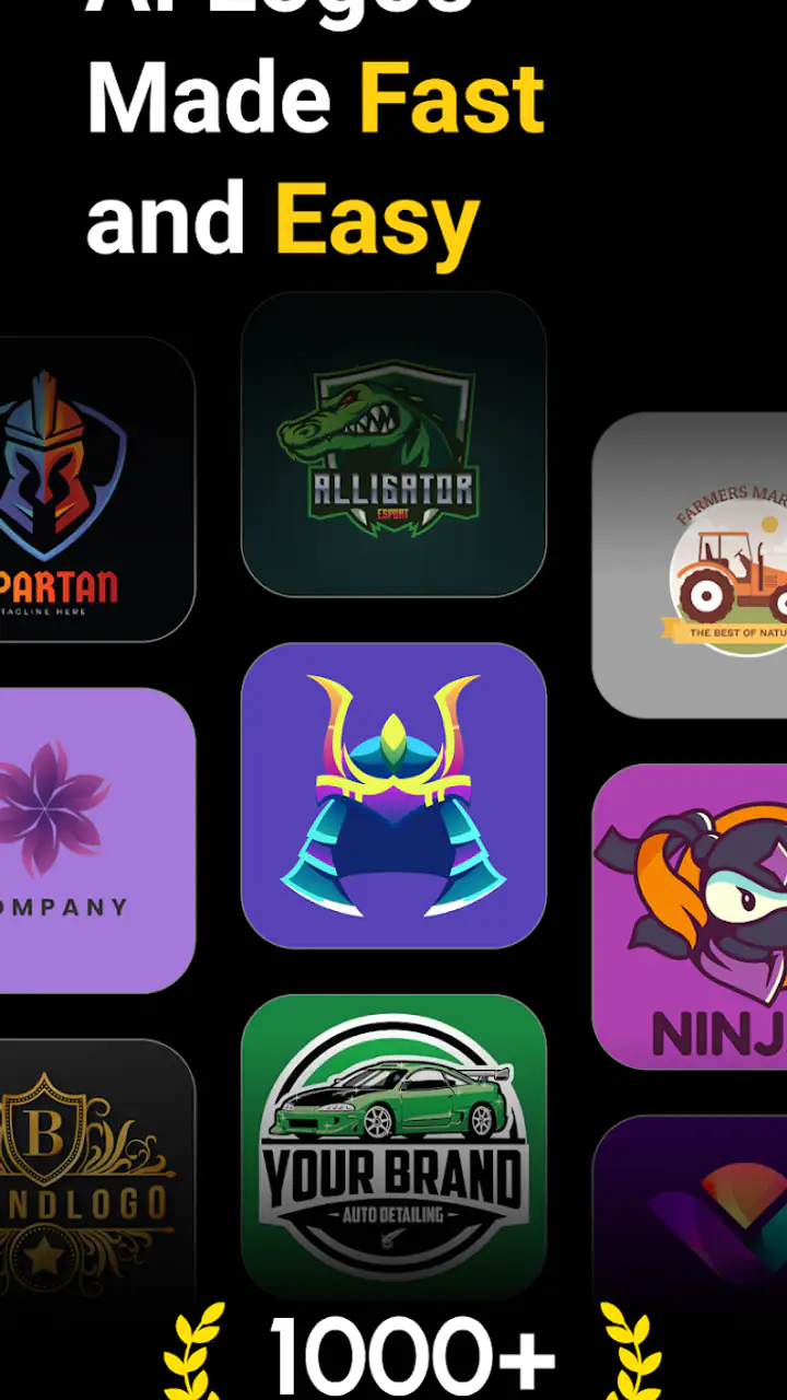
That small preparation saves time. If I start by browsing attractive possibilities with no purpose, I can easily end up with a logo that looks polished but says nothing about the project. A local bakery, a gaming channel, and a handmade jewelry shop may all need a logo, but they should not begin from the same visual assumptions. Even a rough decision about audience and tone gives the app’s creative choices a job to perform.
On a smaller phone, I would also work slowly around text fields and editing controls. Logo work depends on alignment, spacing, and legibility, and a cramped screen can make small differences difficult to judge. I prefer to create a draft, pause, and inspect it away from the editing view rather than trusting the immediate appearance. That is a useful habit with this app because speed is helpful only when it does not hide small layout problems.
Reaching the first useful logo
My recommended first session is deliberately short. Start with the simplest name treatment that represents the project, choose one visual direction, and resist adding decorative elements until the main idea is readable. The first successful action is not merely tapping a create button; it is reaching a draft that another person can recognize after a quick glance.
For example, imagine I am preparing a small social account for weekend bicycle repairs. I would begin with the account name, select a visual cue connected to movement or tools, and keep the color approach restrained. Then I would view the result as a tiny profile image. If the lettering becomes a blur or the symbol looks like an unrelated object, I would return to the draft and remove rather than add. That workflow is more reliable than decorating a weak foundation.
The app’s one-tap sharing emphasis is useful once the draft has passed that basic test. I can show it to a friend, place it beside a sample social post, or use it as a temporary identity while the project develops. Sharing early is valuable because another person may notice a confusing letter, an accidental resemblance, or a color combination that feels different on their screen.
One of the less obvious advantages of a mobile-first tool is immediacy. If an idea appears while I am away from a computer, I can turn it into a visual reference before forgetting it. That makes the app particularly suitable for brainstorming rather than only for final production. I would save several distinct directions instead of making ten tiny variations of one design. A few genuinely different concepts are easier to compare with a partner or client.
There is a trade-off, though. Quick creation can encourage users to accept the first attractive result. I recommend testing the logo in context: place it mentally on a social avatar, a simple product label, a presentation cover, and a plain background. A mark that succeeds in one setting may lose contrast or balance in another. Even without advanced branding tools, this basic checking process improves the quality of the decision.
Where new users may become confused
The word “AI” can create expectations that the app will understand a detailed brief and deliver a finished identity automatically. I would treat it more modestly. The useful role is helping me get moving and explore directions, while the final judgment remains mine. If a generated or suggested result feels generic, that is not a reason to keep pressing for more decoration. It is a signal to sharpen the project idea and make a deliberate choice.
Another common confusion is believing that a logo needs many visual ingredients to look professional. In practice, a name, a clear shape, and a controlled color relationship are often enough for a first version. I found that the app is easier to use when I ask of every element, “Does this help recognition?” If the answer is no, removing it usually improves the result more than adding another effect.
Color can cause a separate problem. A bright combination may look impressive in the editor but become tiring or unreadable in everyday use. I would check the design against both a light and a dark surrounding area, especially if the logo will appear in social media posts or marketplace listings. If the app offers a choice that looks striking but reduces contrast, I would favor clarity over novelty.
Text is another area where patience pays off. Names with unusual spelling, narrow letters, or several words need extra attention at small sizes. I would read the logo from a distance and ask someone unfamiliar with the project to say what they see. If they misread the name, the design has a practical problem even if the typography looks stylish.
It is also worth separating a draft from a final asset. A logo created quickly can be perfectly useful for testing an idea, but a growing business may later need consistent versions for different backgrounds, print materials, packaging, or professional handoff. This is where a dedicated vector editor or a designer may become the better choice. The app can still serve as the concept stage, but I would not assume that a mobile draft automatically covers every future branding requirement.
How it compares with familiar alternatives
Compared with starting from a blank canvas in a general drawing app, this logo creator is more reassuring for beginners. A drawing app gives broader freedom but also demands that I understand composition, layers, shapes, and export decisions from the beginning. Here, the narrower purpose is an advantage when I need a recognizable logo quickly rather than an illustration with complete manual control.
Compared with a desktop design suite, the app is less suitable for precision work and long brand projects. Professional software is better when I need exact spacing, reusable vector components, carefully managed color systems, or multiple coordinated assets. Its advantage is not depth; it is convenience. I can use it on a phone, explore a concept in a few minutes, and share that concept without setting up a full workstation.
Online template services may offer a larger browsing experience and more room for comparing layouts. They can be preferable when I want to examine many ready-made styles at once or build several marketing materials around a logo. The mobile app feels more appropriate when the immediate task is simply to create a logo idea and keep momentum. I would choose based on the job, not on the assumption that one tool must handle every stage.
There is also a difference between a logo generator and a drawing tool. A drawing tool rewards personal construction from basic shapes, while this app is aimed at shortening the distance between an idea and a presentable draft. Someone who enjoys drawing every curve may find the guided approach limiting. Someone who has never designed before may find that limitation helpful because it reduces the number of decisions that can go wrong.
Practical workflows beyond the first draft
I see three especially useful ways to keep using the app after the initial experiment. First, it can act as a naming-and-identity checkpoint. Before investing in packaging or a website, I can create a few visual treatments for the same name and notice which one still feels appropriate after the initial excitement fades.
Second, it can help with comparison conversations. Instead of explaining an abstract idea such as “friendly but dependable,” I can share two or three contrasting drafts and ask which one better matches the intended audience. This turns a vague discussion into a concrete decision. The important discipline is to change one major direction at a time; otherwise feedback becomes difficult to interpret.
Third, it can support temporary projects. A school club, local event, online group, or short-term sale may need a recognizable symbol without justifying a full branding budget. In those cases, the app’s speed is a genuine strength. I would still keep the design simple enough that it can be recreated or refined later if the project becomes permanent.
A useful advanced habit is to create a “small-screen test” before sharing. I would view the logo at the size of a typical account image, then hide the surrounding editing context and look at it as if it appeared in a busy feed. This reveals whether the central shape and name survive distraction. It is a more realistic test than admiring the design at full screen.
Another good habit is to make a monochrome check, even if the app’s main appeal is colorful creation. Imagine the mark in plain black or white. If its identity collapses without color, the shape or lettering may not be doing enough work. This does not mean the final logo must be monochrome; it simply exposes whether color is supporting recognition or carrying the entire design.
I would also keep the first share focused. Send one draft with a short question, such as whether the name is readable or whether the symbol matches the project. Asking for general opinions often produces comments about personal taste rather than useful feedback. Specific questions help turn the app’s quick sharing workflow into a practical design review.
Who should use it and who should look elsewhere
I would recommend this app to a first-time creator who wants a friendly starting point, a small seller testing an idea, a student preparing a project identity, or a social media user who needs a recognizable mark without learning a complicated editor. It is also a sensible choice for brainstorming on an Android phone, especially when the goal is to produce several directions quickly and discuss them with someone else.
I would be more cautious if the logo represents an established company, a product that will be printed widely, or a brand expected to remain unchanged for years. In those situations, the cost of inconsistent spacing, limited editing control, or an unsuitable final format can be higher than the convenience of fast creation. I would use this app for early concepts, then move to a professional workflow when the identity becomes commercially important.
Users who dislike guided creation or want to draw custom symbols from scratch may also prefer a general illustration app. Likewise, anyone expecting the AI label to remove all creative decisions may feel disappointed. The app can make the beginning easier, but it cannot decide what the brand should mean or whether a visual idea is distinctive enough.
The purchase model is another point to consider before committing to a polished result. Installation is free, while individual in-app purchases are listed from $0.49 to $33.99. I would explore the free experience first, identify whether the basic workflow solves my problem, and only then consider paying for an item that directly improves the project. That approach avoids spending simply because a more elaborate option appears attractive.
My recommendation after using the workflow
For me, AI Logo Maker & Logo Creator works best as a low-pressure first step. It makes the blank-page problem smaller, gives beginners a way to think visually, and supports quick sharing when a rough idea needs outside feedback. Its value comes from momentum rather than deep control, and that is exactly what many first-time users need.
I would install it when I needed a fast concept for a new account, small project, or temporary venture. I would prepare the name, decide on the intended mood, create a restrained draft, and test it at a small size before showing it to anyone. That path leads to a meaningful result without requiring design experience.
At the same time, I would keep expectations realistic. A polished-looking draft is not automatically a complete brand identity, and a convenient mobile workflow cannot replace precision tools when the requirements become demanding. The smartest way to use this app is as a bridge: start with a clear, shareable idea here, learn what works, and move to a more specialized solution only when the project genuinely needs it.
Overall, I think it is a worthwhile free starting point for beginners who want to create and share a logo without getting buried in technical controls. The best results come from editing with restraint, checking readability in real situations, and treating the first logo as a practical concept rather than an untouchable final answer. If your goal is to turn a rough idea into a logo you can discuss today, this app is an easy place to begin.
FAQs for AI Logo Maker & Logo Creator
What is AI Logo Maker & Logo Creator, and what can I use it for?
AI Logo Maker & Logo Creator is a design app that helps you create logos for businesses, websites, online stores, social media profiles, and personal projects. Instead of drawing everything from scratch, you can enter a brand name, choose an industry or style, and explore automatically generated ideas. It is especially useful for beginners who need a quick starting point, although professional branding projects may still require more advanced design software.
Do I need design experience to create a logo with the app?
No, the app is designed for users with little or no graphic design experience. Its templates, AI-generated concepts, icons, fonts, colors, and editing controls make it possible to build a logo through a relatively simple process. You can usually modify the suggested design by changing text, layout, colors, and symbols. However, creating a polished result may still require patience and some understanding of visual balance and readability.
Is AI Logo Maker & Logo Creator free to download and use?
The app may be available to download at no initial cost, but some features, templates, export options, or premium design elements can require payment. Depending on the version and platform, access may be offered through in-app purchases or a subscription. Before confirming a purchase or starting a trial, review the pricing, renewal terms, and cancellation instructions shown in the app store and inside the application.
Can I export my logo in a high-quality or transparent format?
Export options depend on the app version and the plan associated with your account. Many logo maker apps allow users to save designs as common image files, while transparent backgrounds, higher resolutions, or additional formats may be restricted to premium users. If you need a logo for printing, packaging, or professional marketing, check the available resolution and file types before finalizing your design.
Can I use the logos commercially, and are the designs unique?
You should carefully check the app’s licensing terms before using a generated logo for commercial purposes. AI-created designs may combine templates, icons, fonts, or visual elements that are also available to other users, so the result may not provide exclusive trademark protection. For a business identity that must be legally distinctive, search for similar logos and consider consulting a branding or trademark professional before publishing it.
Pros
- Creates multiple logo concepts quickly from a short text description.
- Offers templates suited to different industries and branding styles.
- Exports designs in common formats for easy online use.
- Simple editing tools make basic customization accessible to beginners.
- Useful for testing brand ideas before hiring a professional designer.
Cons
- AI-generated designs may look generic or resemble existing logo styles.
- Some high-resolution exports or assets may require a paid plan.
- Text rendering in generated logos can occasionally contain mistakes.
- Advanced users may find the editing and layout controls too limited.
- An internet connection may be needed for generation and some app features.


